Marketing platform
and Digital Identity
for Olive AI


A refined aesthetic
to deliver on Olive’s expansive vision.
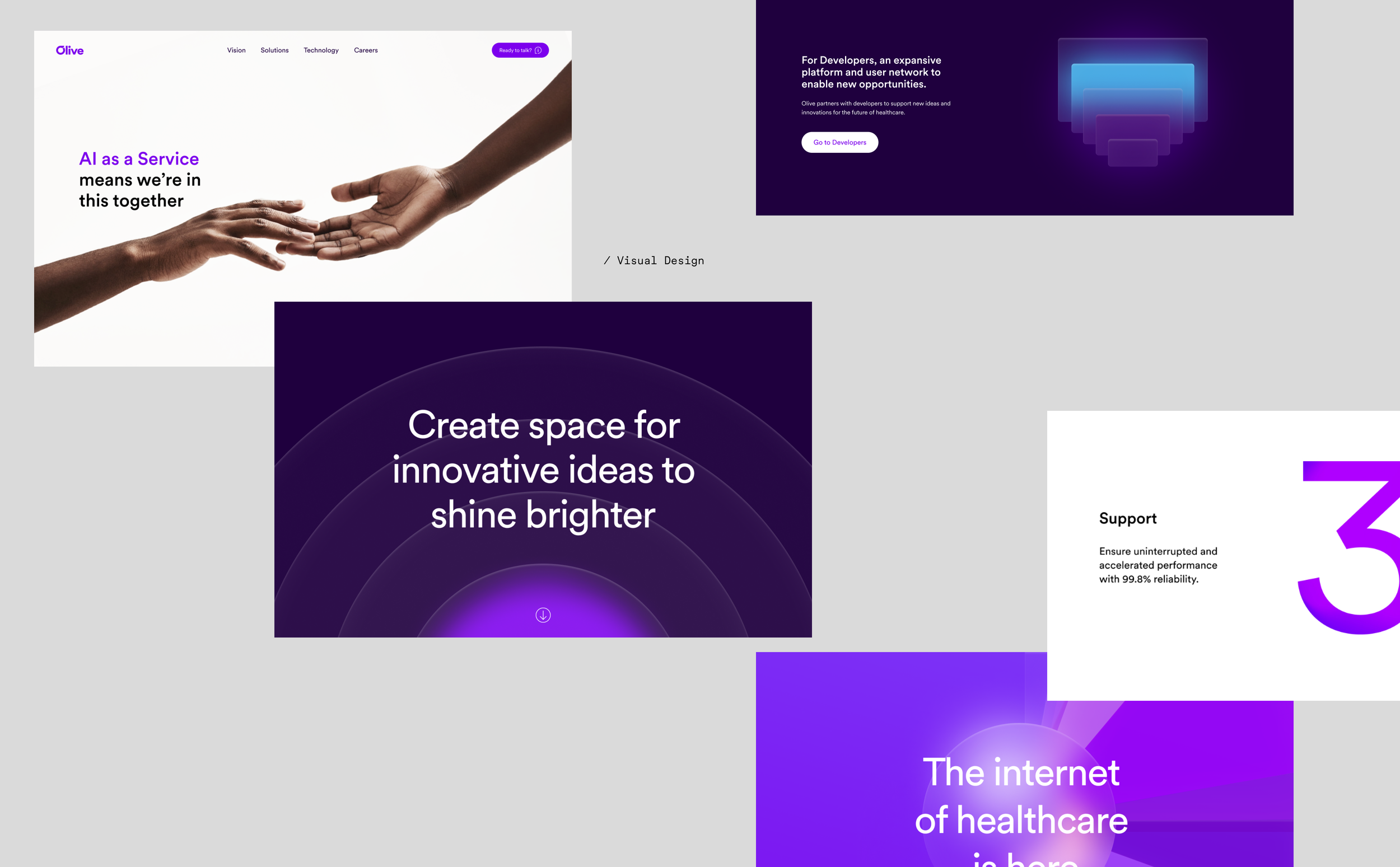
We took the Olive brand identity further, giving the system more space to breathe and a clearer sense of hierarchy, supported by a tighter photographic direction. Color served as both as identity and a navigational tool, tying ideas together through consistent visual cues.
To complete the language, we developed a new illustration system that brings Olive’s concepts to life with clarity and personality.

Using illustrations
to explain complex ideas.
Healthcare systems have many hidden, intricated processes that are hard to picture. Our illustrations aimed to show these clearly. They helped highlight products and key points while making complex ideas easier to understand through strong visual metaphors.


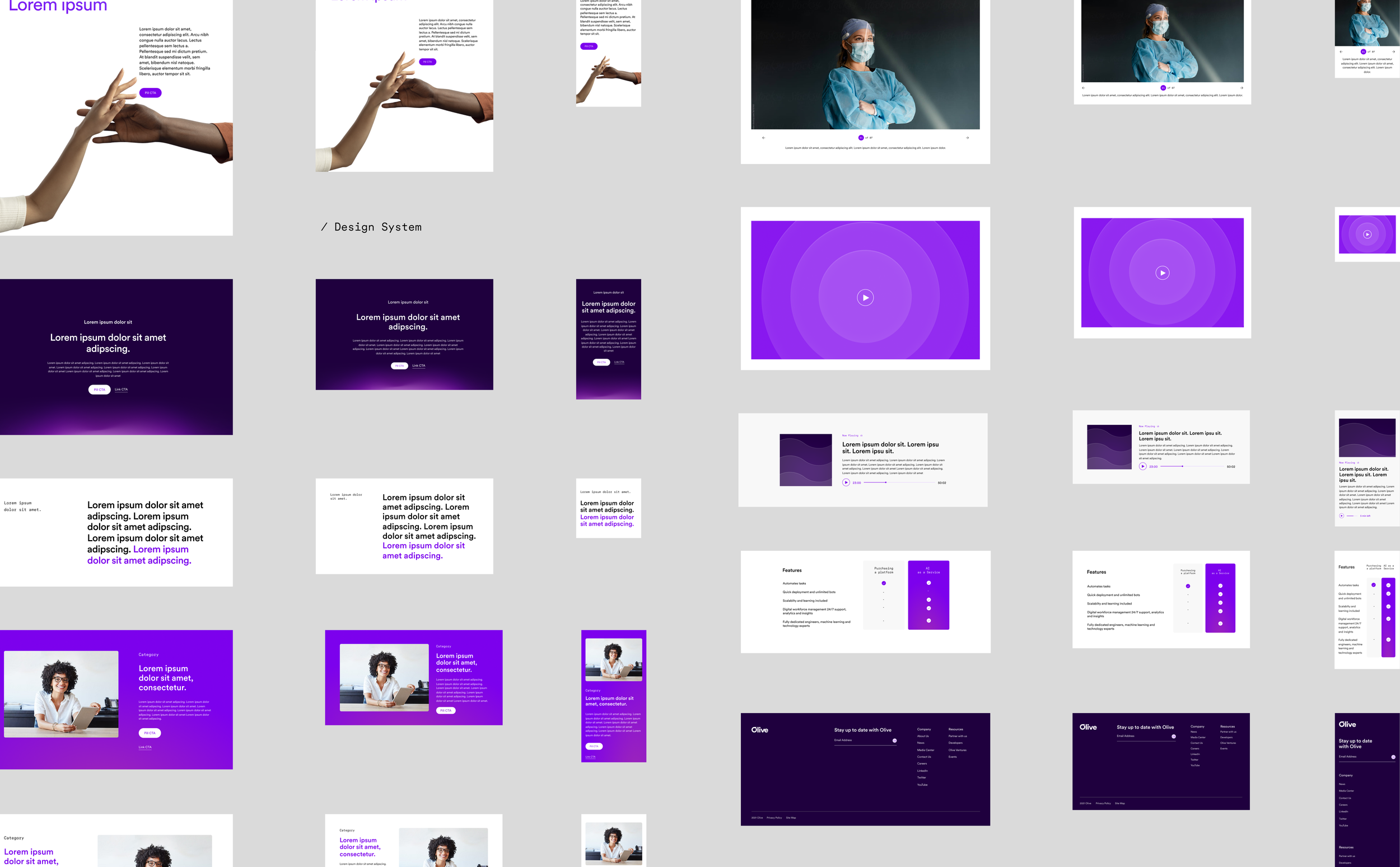
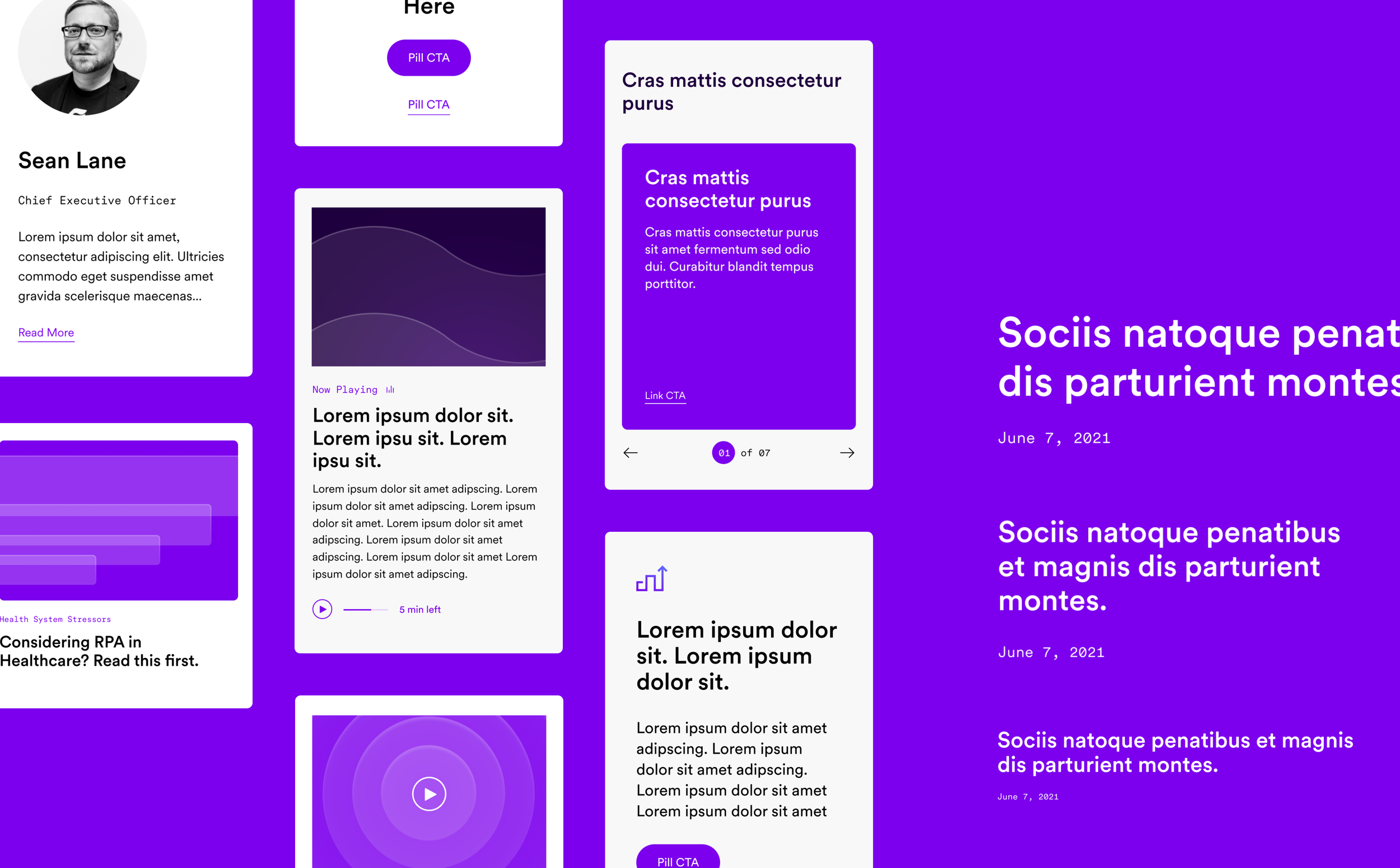
A modular design system that keeps the brand consistent and supports continuous development.
We created a robust design language system that enables component-driven deployment and development. A key feature for a company like Olive was still growing and developing — they needed a website that can grow and evolve as quickly as they were.
Agency
AKQA
Scope
Visual Design
UI
Illustrations
Credits
Group Creative Director: Alec Ericsson
Creative direction: Andy Wong, Felipe Yamaoka
Product design: Kate Scally
UX: Thane Lochtie
Copywriting: Brian Simpson
Animations: LungYi Lin
The project
Olive is a startup focused on AI and process-automation solutions for healthcare. Their technology streamlines robotic, error-prone workflows by emulating the manual tasks employees typically handle. Together with the AKQA team, we created a scalable digital brand identity and design system built to grow with Olive’s future needs.